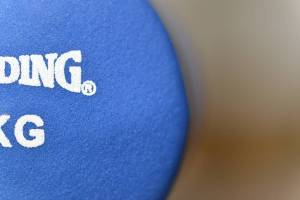
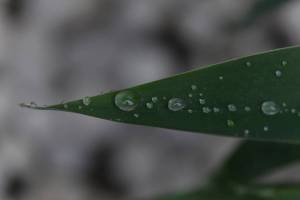
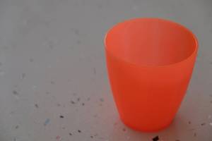
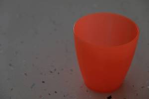
This exercise required a dominate primary or secondary colour to dominate the image. And to produce images that matched the six primary and secondary colours closely; red, blue, yellow (primary) green, violet, orange (secondary). Varying the exposure by 2/3 of a stop either side of the metered exposure to alter the brightness of the colour.

Equipment used Nikon DSLR, 105mm lens, tripod and a macro light (some shots). Limited (no exposure or colour) post processing in NX2 and DXO.
Many photographs and prints later I have my final images for the six primary and secondary colours. I have marked which exposure I believe most accurately represents the colour for the printed image this a small x.
Primary colours (pigment)
Red
+2/3 exposure

Metered exposure
 X
X
-2/3 exposure

Blue
+2/3 exposure

Metered exposure

-2/3 exposure
 X
X
Yellow
+2/3 exposure
 X
X
Metered exposure

-2/3 exposure

Secondary colours (pigment)
Green
+2/3 exposure

Metered exposure
 X
X
-2/3 exposure

Violet
+2/3 exposure

Metered exposure
 X
X
-2/3 exposure

Orange
+2/3 exposure

Metered exposure
 X
X
-2/3 exposure

For me this exercise opens a whole can of worms for accurate colour reproduction. Colour temperature of the light source & accurate white balance, the errors in uncalibrated monitors and printers, colour temperature of the viewing light (prints). Combined with how well the eye adapts to lighting variations and light temperature better than any camera. But that’s all probably going a little to far for this exercise.
